gestalt-laws
Joaquin Attanasio

Joaquin Attanasio

Business Intelligence Consultant | Microstrategy Expert | Data Specialist

Other Articles:

Gestalt Laws

Share on linkedin
LinkedIn
Share on facebook
Facebook
Share on twitter
Twitter
Share on whatsapp
WhatsApp

Good morning to all! Here we are again in our little and warm space of #BestInMicro! A small space where I’m telling you tricks, secrets and experiences in the wonderful world of consulting.

We will leave MicroStrategy aside for today. The truth is that we can be the best architects or administrators, but what gives value to the tool is that users use it. For this, in addition to having an optimal system, it is of vital importance that our dashboards reflect the information in the best possible way. And here, when it comes to interpreting what it sees, the brain acts in a very peculiar way. That is why today we will see a little bit of how we react to different designs depending on colours, shapes and distribution of the objects we present. Ladies and gentlemen, today I bring you: The Gestalt Laws.

Gestalt Laws

What are the Gestalt laws?

Gestalt was a psychological school that emerged in Germany in the early 20th century.  It is a set of principles that analyse the perception of compositions of elements in the subconscious.

The term gestalthas no precise translation into English. The focus of this current was the study of perception and it postulated that images are perceived as a whole; more as a form or configuration than as a mere sum of their parts. 

In short, Gestalt analysed how the eye organises visual experiences and how they are interpreted by the brain. It is not a theory of design, but its conclusions are relevant to visual communication, and it is used in any kind of design (be it for brochures, marketing, dashboards, websites, etc.). Today I’ll focus it on dashboard design, but the same conditions apply for UI/UX design, as well explained by Eliana Gkogka in her blog (from where I use several images here).

What are they based on?

As we said before, the principles of the Gestalt laws start from the basis of how the brain behaves when perceiving images. There are 4 ideas or key points:

1. Emergence: People tend to identify elements first in their general delineated form. Our brain recognises a simple, well-defined object more quickly than a detailed one.

Gestalt Laws Emergence

2. Reification: People can recognise objects even when parts of them are missing. Our brain matches what we see with familiar patterns stored in our memory and fills in the gaps. That’s why simple logos work so well.

Gestalt Laws Reification

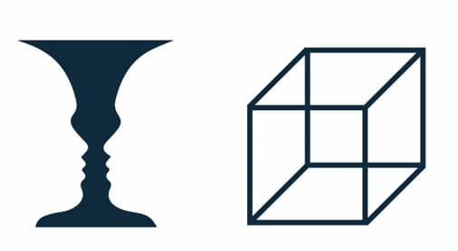
3. Multi-estability: People can identify different objects in ambiguous ways, getting one main form and another more difficult to be identified. As a result, one view will become more dominant while the other will be more difficult to see.

Gestalt Laws Multistability

4. Invariance: Humans recognise simple objects independently of their rotation, scale and translation. Our brain perceives objects from different perspectives, despite their different appearance.

Gestalt Laws Invariance

It’s a bit crazy, isn’t it? Have you ever thought about these concepts before? Optical illusions play a lot with these principles… and advertising, not to mention!

So, let’s move on… with you, here they are, these are the laws of Gestalt.

Gestalt Laws

1. Principle of Similarity

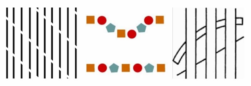
Elements that share similar visual characteristics are perceived to be more closely related than those that do not share similar characteristics.

When having figures or images of similar characteristics (either by colour, shape, size, etc.), the brain automatically takes each individual element as part of a group.

In the same way, you can take an object and highlight or emphasise it by generating an anomaly. In other words, the pattern of similarity with the rest of the objects is broken.

Gestalt Laws Similarity

In the first image, we can distinguish two distinct groups, while in the second, we see three black and two orange columns, instead of different evenly distributed points.

Here is another, slightly more graphic example. In the image, the orange colour helps to establish a connection between the province of Córdoba (Argentina), its surface area and its population in comparison with the rest of the country.

Gestalt Laws Similarity Image

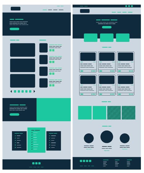
Taking advantage of this principle when designing a dashboard or application allows you to group links, navigation buttons, graphics and even highlight relevant information. For example, in the following image, without having a single word or number, we can easily perceive how the elements are organised and grouped.

Gestalt Laws Similarity Example

2- Continuity

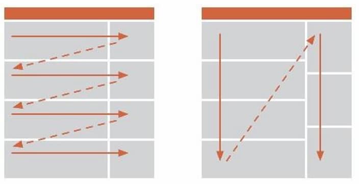
When we read a book, we read from left to right and from top to bottom. In other cultures, the order is different. This may seem basic, but it is very important when defining the order or sequence of objects.

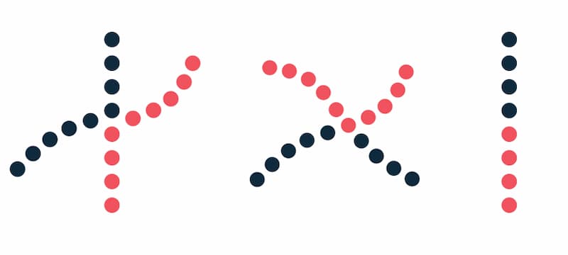
Many artists, such as van Gogh, play with static movement. In the following image, you will see that the lines cross, right?

gestalt-laws-continuity

Of course! Although … they can also be two opposite angles: continuation-law-1 and gestalt-law-2 . The brain visualises the movement and interprets it. This needs to be considered when designing dashboards. Movement indicates evolution, and if there is no relationship between each of the figures, the eye receives signals of something that does not exist, creating a unity between independent objects.
Gestalt Laws Continuity Image

Elements that follow a continuous line are perceived as grouped together. The smoother the line segments are, the more we see them as a unified form; our mind prefers the path of least resistance.

Gestalt Laws Continuity Example

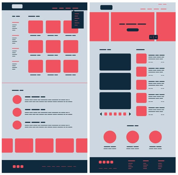
If you take a quick look at the image below, what impression does it give you? don’t you feel that discomfort of following the colour or following the line?

Gestalt Laws Continuity Example 2

When designing a dashboard or putting together a graph or report, the linear arrangement of rows and columns are good examples of continuity. They can be used in menus and submenus, lists, headings, selectors, etc.

Gestalt Laws Continuity Dashboard

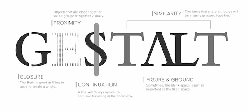
3- Closure

This principle is widely used in iconography. As I mentioned before, it is widely exploited when it comes to creating simple logos. This technique uses the tendency we have to close shapes.

Gestalt Laws Closure

This happens because closed and finished forms are more visually stable, which makes us tend to close and complete the perceived forms with our imagination, seeking the best possible organisation.

If we take it to design, when presented with the right amount of information, our brain will jump to conclusions by filling in the gaps and creating a unified whole. In this way we can reduce the number of elements needed to communicate information, reducing complexity and making designs more attractive. The closure can help us to minimise visual noise and convey a message, reinforcing a concept within a fairly small space.

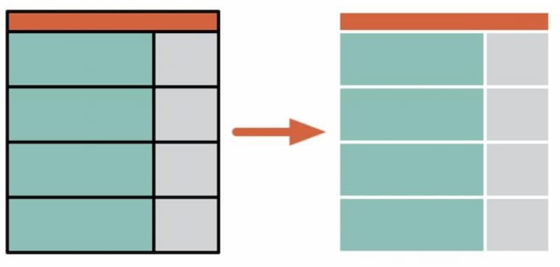
For example, in the following grid we see the difference between putting black lines dividing the rows and columns, or leaving them empty, giving our brain room to generate that separation. It’s much cleaner and more pleasing to the eye, isn’t it?

Gestalt Laws Closure Image

4– Proximity

When we place shapes and forms, the eye generates a direct relationship between the time-space distance between the objects.

Gestalt Laws Proximity

We can use the proximity principle in dashboard design to group similar information, organise content and order layouts. Their correct use will have a positive impact on visual communication and user experience.

As the principle states, elements that are related should remain close to each other, while unrelated elements should be kept further apart. White space plays a vital role here, as it creates a contrast that guides users’ eyes in the desired direction. White space can boost visual hierarchy and information flow, contributing to designs that are easy to read and interpret.

5- Figure-Ground

As mentioned at the beginning, the brain is not able to focus on two images simultaneously. Tell me what you see under here… a tree or animals?

Gestalt Laws Figure-Ground

We can define the figure as an element that exists in a space or field, standing out in its interrelation with other elements, while the background is the part of the field that contains interrelated elements that support the figure, which, due to its contrast, tends to disappear.

It is very important to keep in mind that, if the background is mixed with the colours, textures or shapes that we show in our graphics, not only can we end up losing the thread of the storytelling of our dashboard, but it can also cause some data to get lost along the way.

6- Symmetry and Order

Symmetrical elements are more visually pleasing and harmonious. They give a sense of order and stability.

This principle focuses on the fact that a composition should not provide a sense of entropy (disorder), otherwise the viewer will waste time trying to locate the missing element, or solve the problem, instead of focusing on the message that the composition or design wants to convey.

From here comes the importance of respecting distances, white spaces, hierarchies of objects and how the different elements are grouped within our dashboard.

If you look at the image below, you will see that the first reflex you have is to see as a group those elements that are in symmetry, regardless of colour, distance or shape.

Gestalt Laws Symmetry and Order

7- Pregnancy (or good shape)

Pregnancy is defined as the simplest or easiest way of interpreting and presenting figures or objects. Likewise, simple forms are more appealing than complex ones.

It is said that what is perceived is pregnant when it can be recognised after an ordinary verbal description.

When designing logos, for example, this is one of the most important factors, as an image is more “catchy” when it can be remembered quickly. If I show you some of the following images, you will recognise them easily, won’t you?

Gestalt Laws Pregnancy

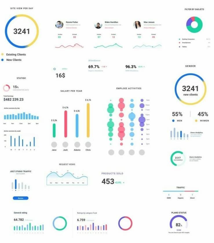
Back in our case, talking about boards and dashboards, it often happens that they have an excess of colours, shapes, textures, graphics, without any kind of order or hierarchy. Here below there is a dashboard which, when looking at each chart individually may be very well done, but in the overall picture it is so unimpressive that it loses the sense of what it shows and it is impossible to get any information out of it.

Gestalt Laws Pregnancy Dashboard

8- Experience

This principle is based on the fact that each person, depending on their origin, culture or knowledge, can interpret or read the board in a different way. As I explained earlier, in Occident we are used to reading from left to right, while in other places information is read in a different direction.

If we look at a dashboard made, for example, in Asia, the images, fonts and colour palettes will undoubtedly be very different from what we are used to here.

This is not based solely on a question of culture or geographical distribution, but is based on the environment in which a person has become accustomed to interpreting his or her context and how he or she observes and perceives what he or she sees.

9- Hierarchy

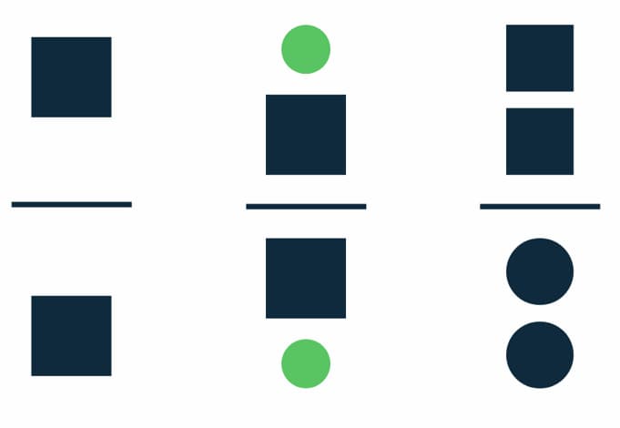
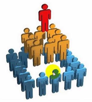
It stresses the importance of presenting the elements in a hierarchical way, from the main to the accessory. That is to say, when we place, for example, a text and below it we place another, we are giving a hierarchy, implying that what is above will have an equal or greater importance or classification than what is below, and conversely we indicate that, at least, what is below belongs to the text above’.

Gestalt Laws Hierarchy

Conclusions

While many of the Gestalt laws seem intuitive, it is important to always keep these kinds of questions in mind. Creating easy-to-read and easy-to-interpret dashboards is essential for users to optimise the use of dashboards and their information. For more info I also recommend you to take a look at the article of my friend Lucas Justo, who gave a good introduction to this topic

Anyway, I hope you found it interesting. I have come across many different names and variants of the laws, but I think I have given a fairly complete summary here. Let me know if you already knew them or if you have discovered something new today. Here I say goodbye, and see you next time!

References

Deja un comentario

Your email address will not be published. Required fields are marked *

Business Data Master Logo

No te pierdas el

WEBINAR
Gratuito

Explicaremos en detalle los contenidos y objetivos del Business Data Master

29/11/2021

18:30 (GTM+1)

Online

BUSINESS DATA MASTER

* Tu información será utilizada exclusivamente para contactarte en relación al Business Data Master. No hacemos spam ni compartimos datos con terceros.